Wayfinding

In this project our team collaborated with the Transformation Office of the Mater Misericordiae University Hospital (MMUH). Our mission was to help the Ophthalmology Department improve its wayfinding system.

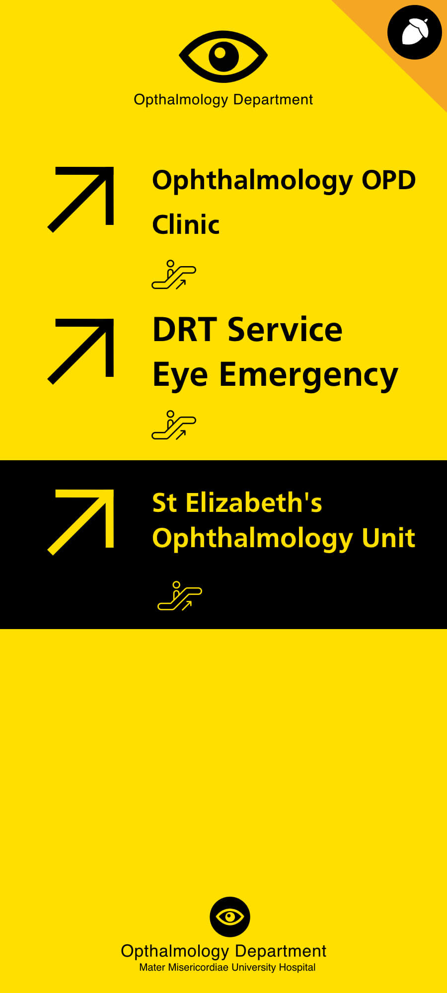
Ophthalmology is one of the largest specialities within MMUH and most of its patients are often elderly with visual difficulties. With this in mind we considered different aspects including typography, chromatics and patient experience. From a practical implementation aspect, we redesigned the branding, the information letters which would be sent to patients and also established banners to assist the patient in finding their way without effort.

Cooperated with Lisa, Eoghan, Alan
Role: Graphic Design & HTML Development
relationship app application

Beginning

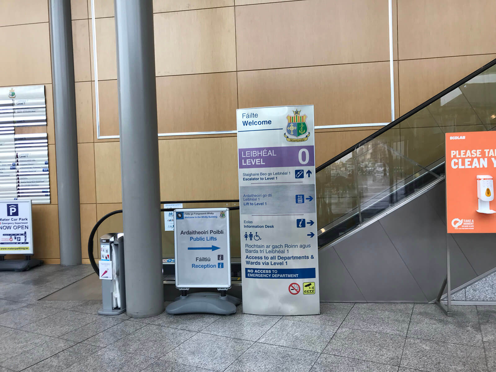
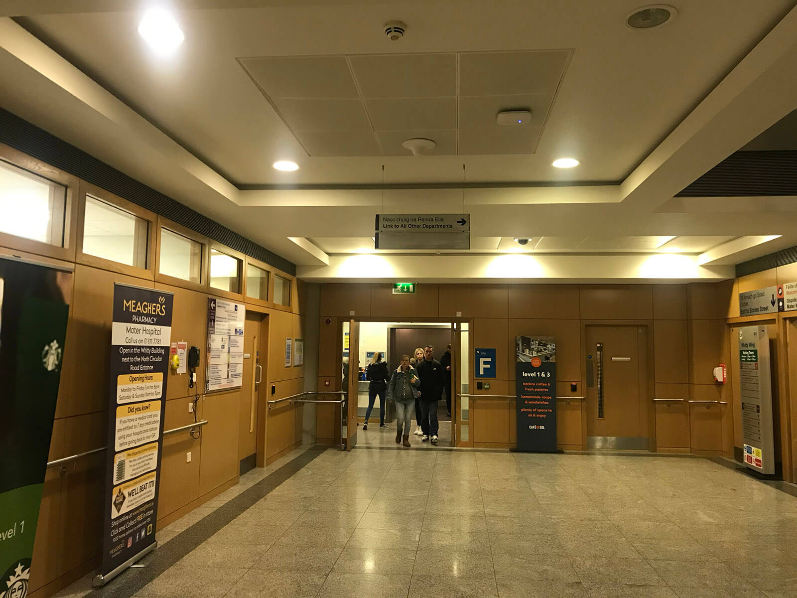
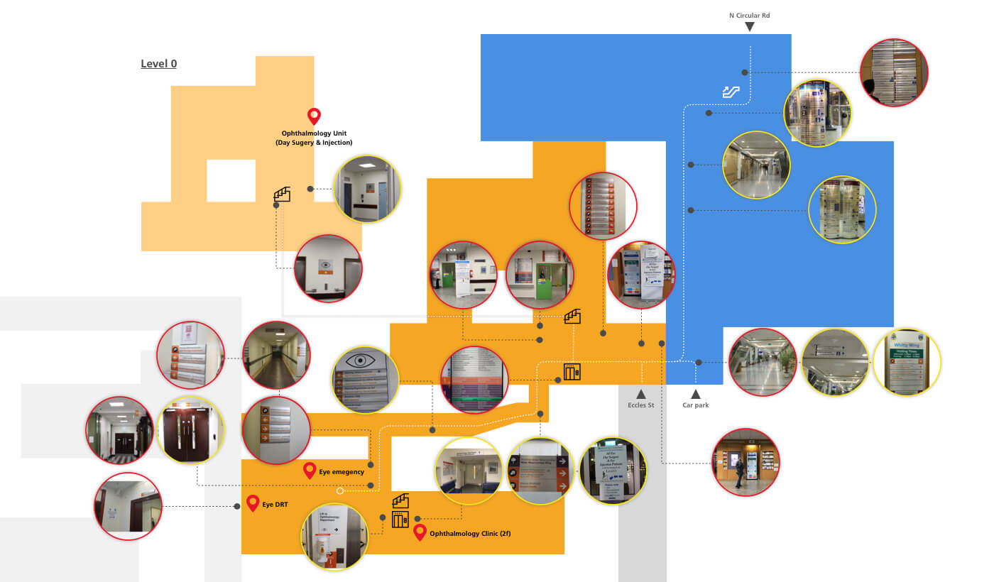
In order to find out the central issue of the matter, our team took the first day to try to find a way to Eye Department as a patient. Basically, a patient has three entrances from outside to into hospital. If a patient take bus or taxi they will use the main entrance (Figure 1) at North Circular Road, or they drive themself and park a car in the hospital they will take a lift to the hallway of Whitty Building (Figure 2) , otherwise they can go to MyGiveny Wing entrance (Figure 3) which is the nearest one to the Eye Department.

1. Instruction board has no information about Ophthalmology Department.

2. There is no guide for eye patients

3. It has the information of Ophthalmology Department in the lobby of MyGiveny Wing but it is obscured.

Patient Experience

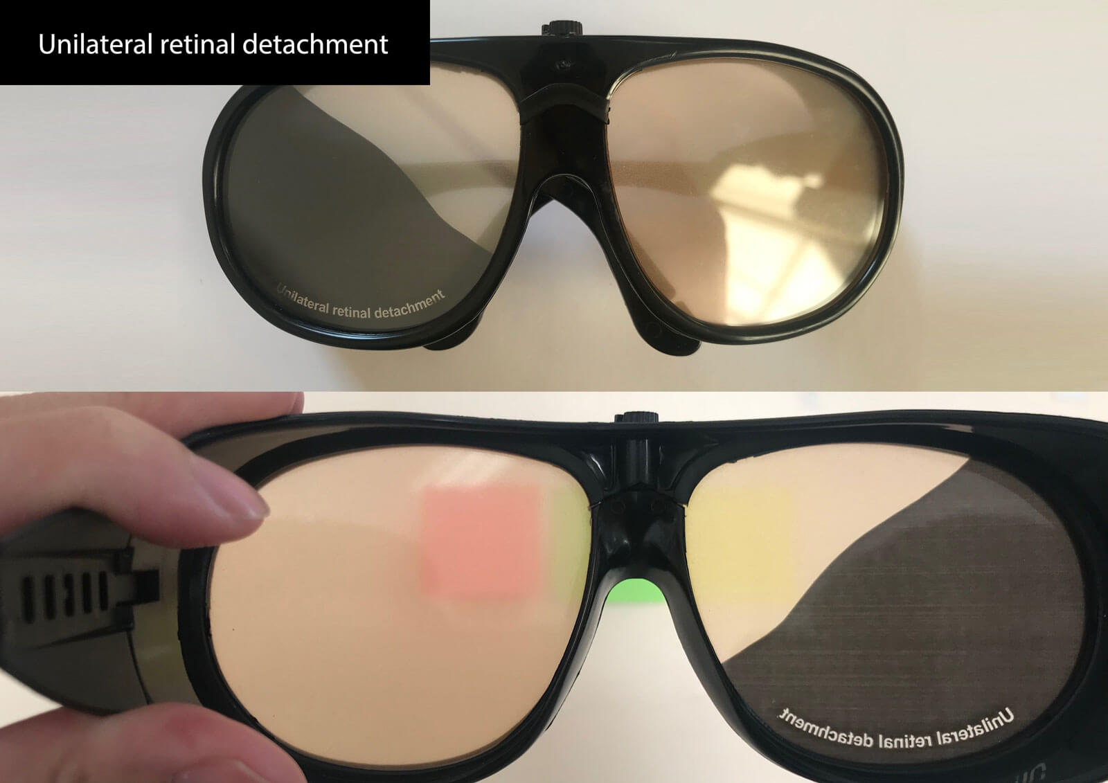
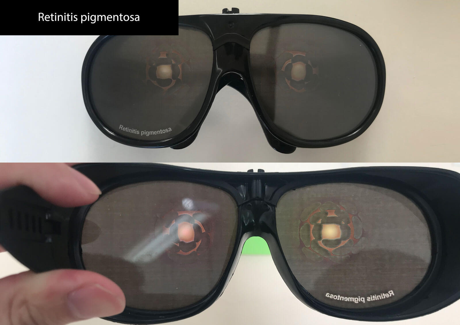
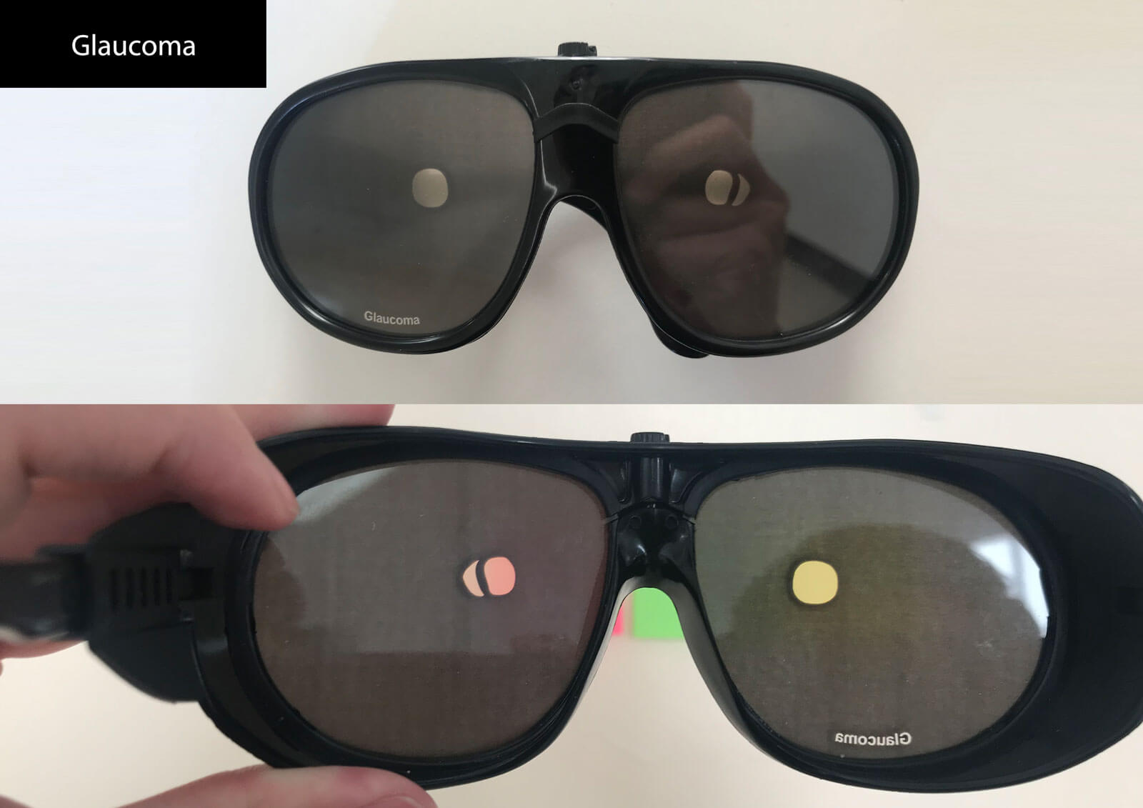
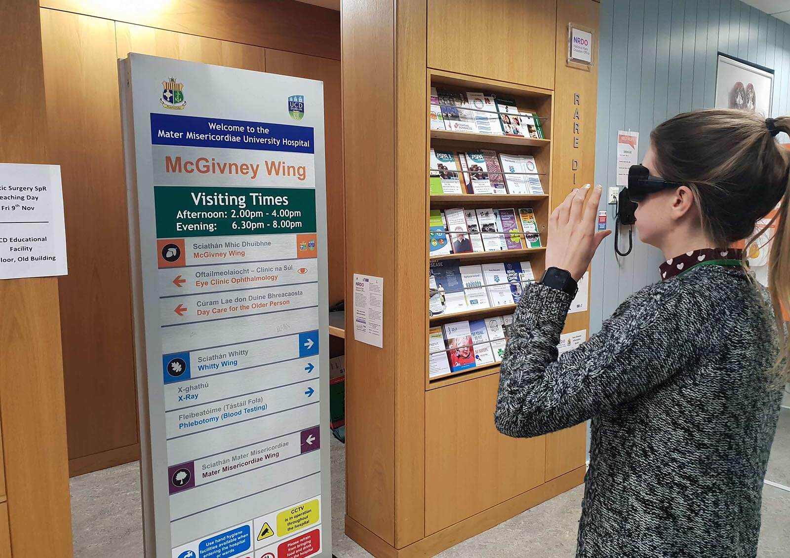
Glaucoma, retinitis pigmentosa and unilateral retinal detachment, these are common eye diseases happening on eldly people. Otherwise we used simulation glasses to put ourself in patient's shoes, stand their view to experience what difficulties they encounter during the time of finding the way.

Visual implenment

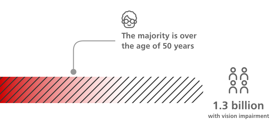
Globally, it is estimated that approximately 1.3 billion people live with some form of vision impairment. Additionally, the majority of people with vision impairment are over the age of 50 years. In order do make our target users easily to recognize a new signage, we did many research regarding theory of color and font implementation before we got into design process.

Color contrast

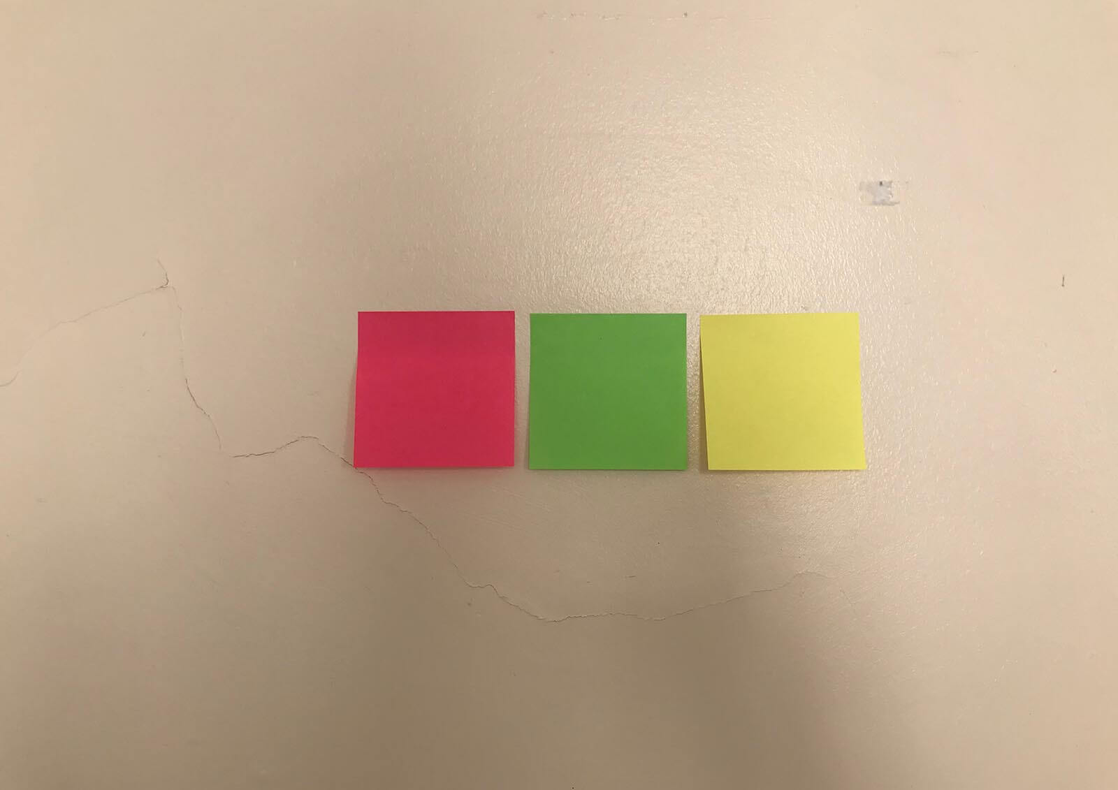
Contrast sensitivity is the ability to perceive the difference in brightness between a foreground and background colour. It is related to the size, distance and illumination of the object to be detected. (University Of Cambridge, Inclusive Design Toolkit) As the photo shown below, combination of black with white and black with yellow have higher contrast levels.

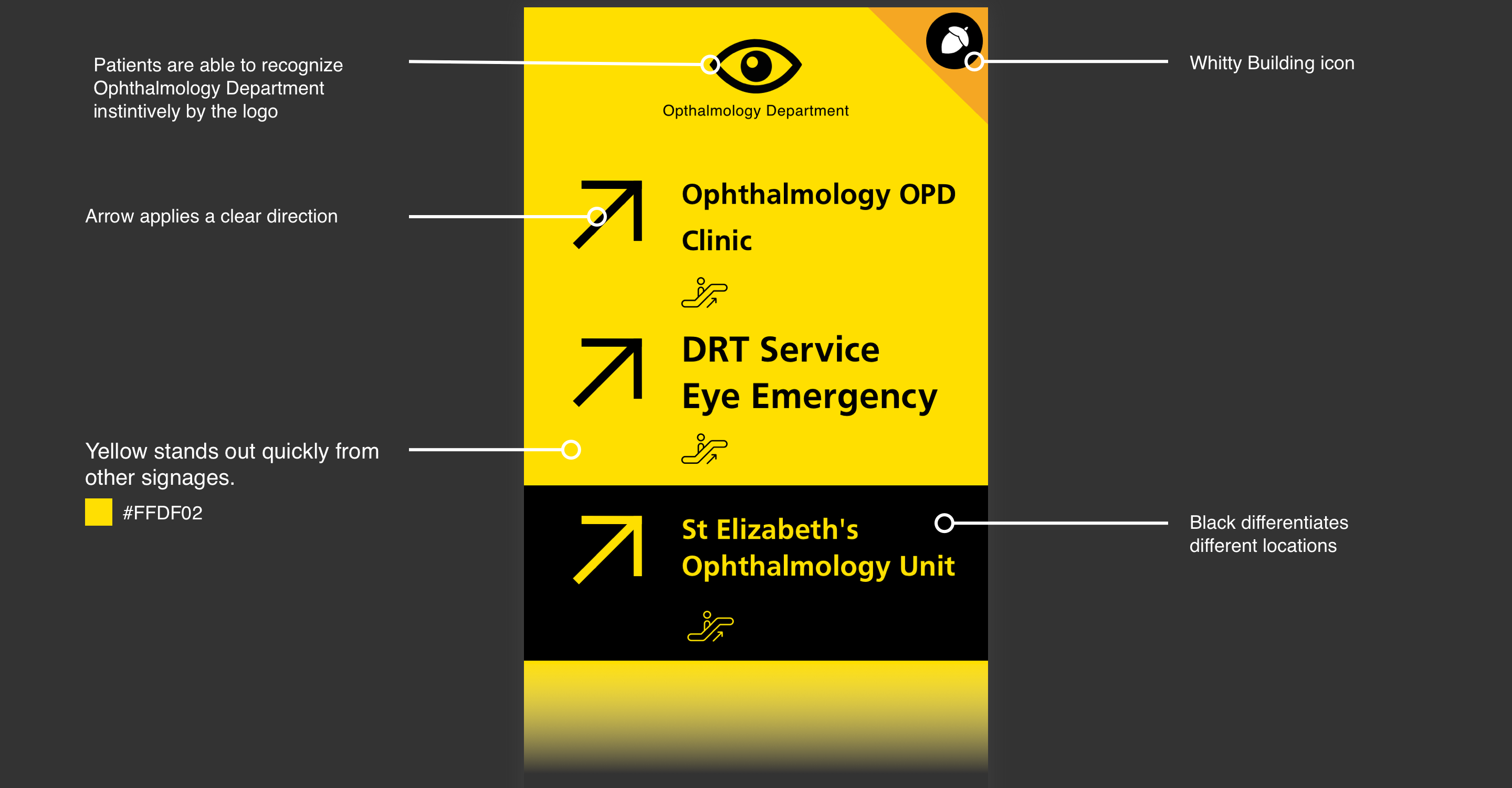
Considering there are already many black and white being used in current signage in MMUH, so we decided to use yellow and black as our main color.

Fonts

Sans-serif fonts are commonly being used on signs, labels or headings because of its legibility. And Frutiger (typeface) is frequently applied due to its highly legible at a distance or at small text sizes.

In distance, the 'i' and 'n' word are unrecognizable in Times. However, you can still discriminate Frutiger ones

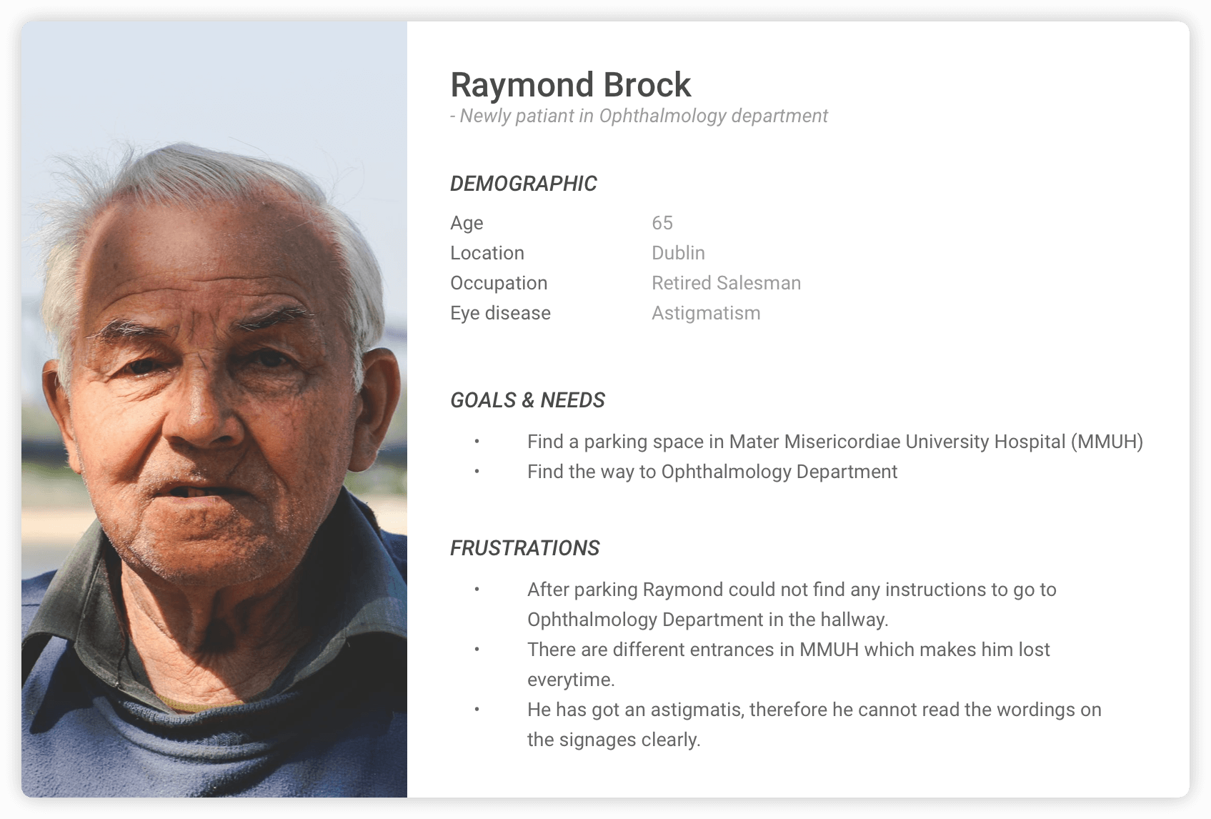
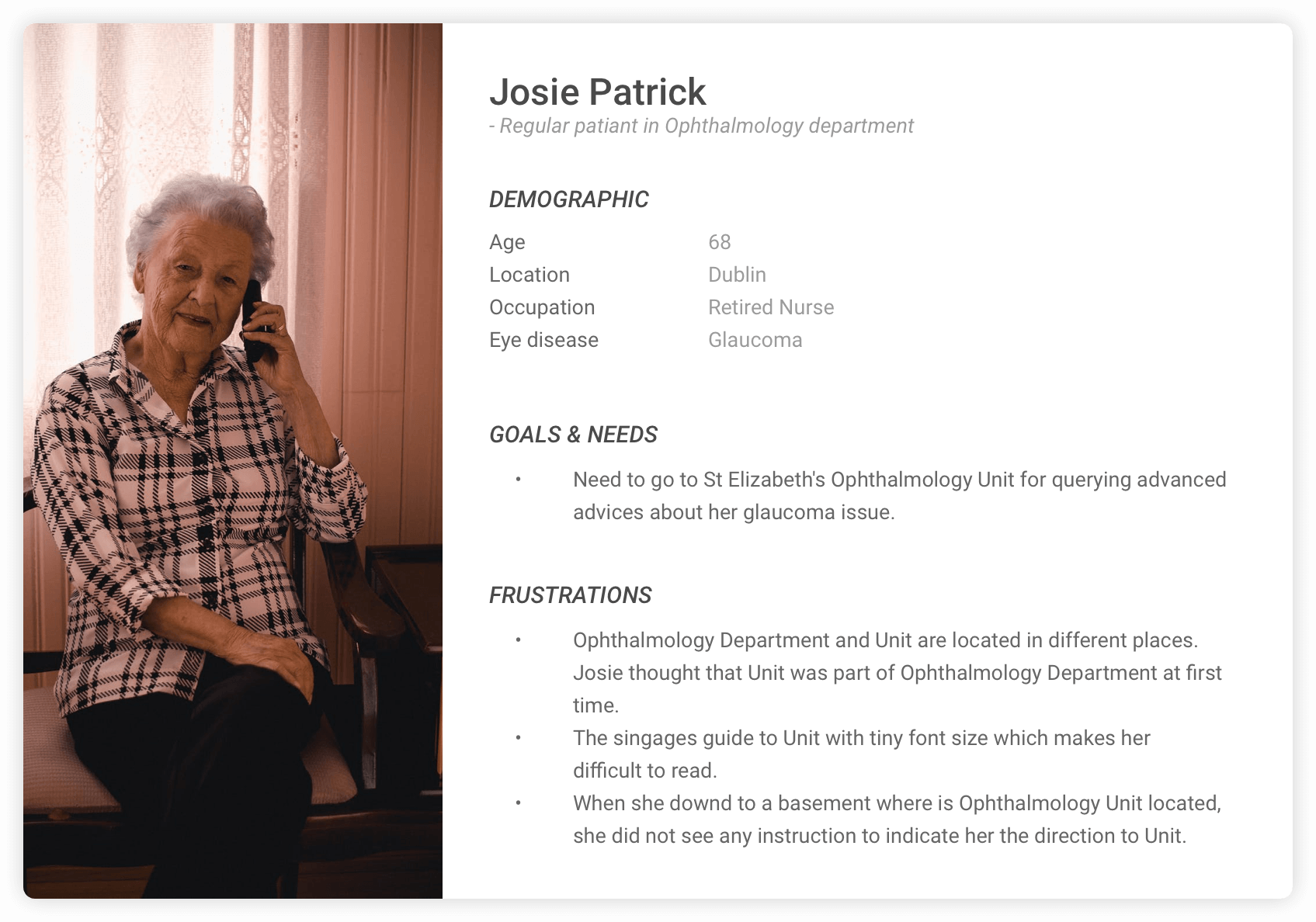
Personas

Signage Design

Implemented in lobby

Implemented in hallway

Implemented in hallway beside other signages

Before and After Comparison

To experience our significant result