OneDegree - IXT
Duration: 6 weeks
Role: Product Designer
In this project, we enhanced the user experience for both beginners and experienced users, making it easier to navigate the IXT system and streamline the process of creating insurance products through improved design.
Here’s a brief overview of the key components:
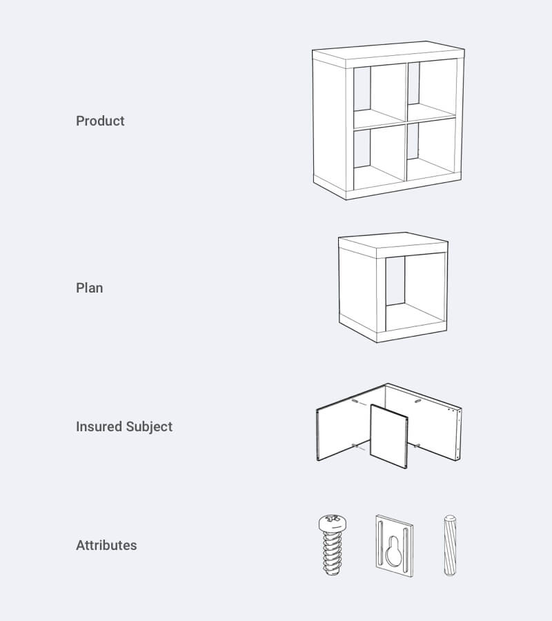
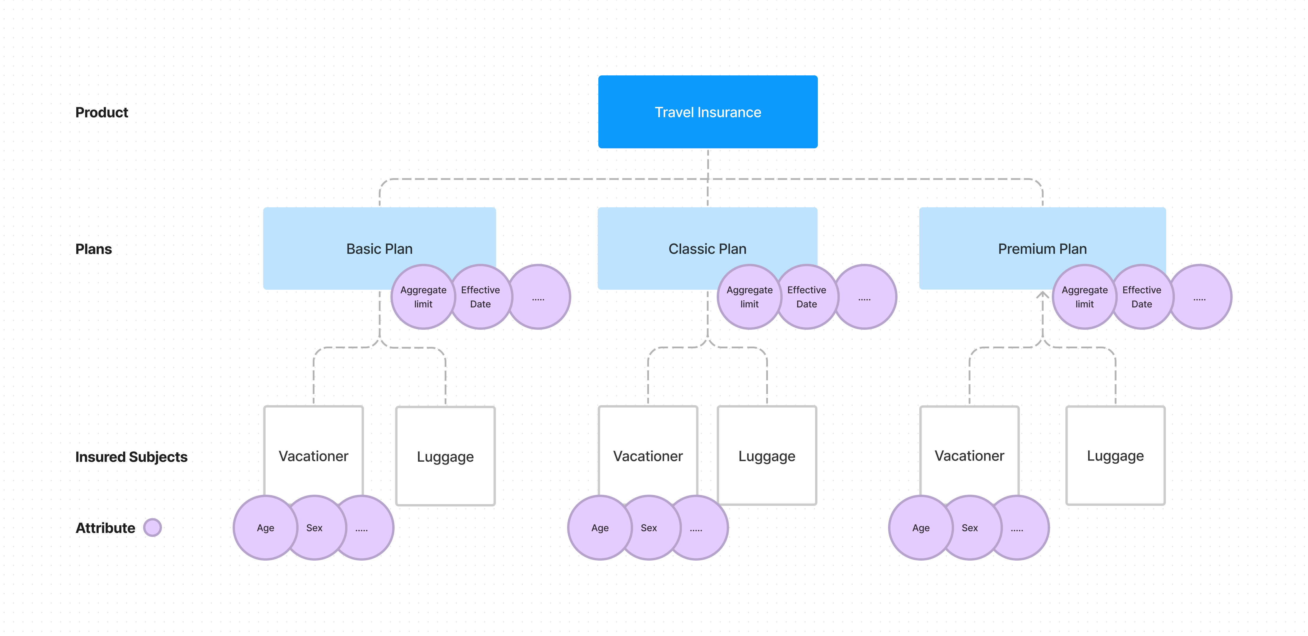
Product: The core offering, such as travel insurance, covering risks like trip cancellations or medical expenses.
Plans: Different options under the product that provide various levels of coverage.
Insured Subjects: The individuals or entities covered by the product.
Attributes: The defining elements of the product, plans, and insured subjects.
Our goal was to make the process more intuitive and user-friendly for all.
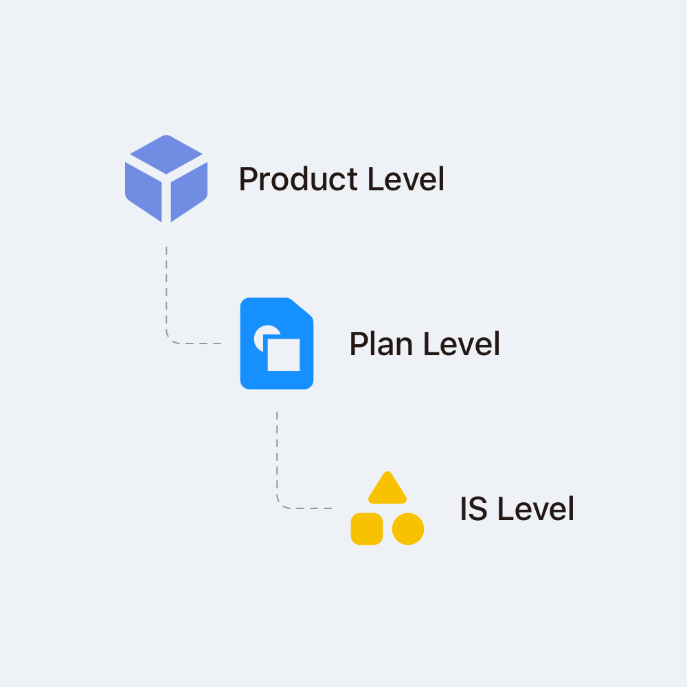
The hierarchy of insurance product
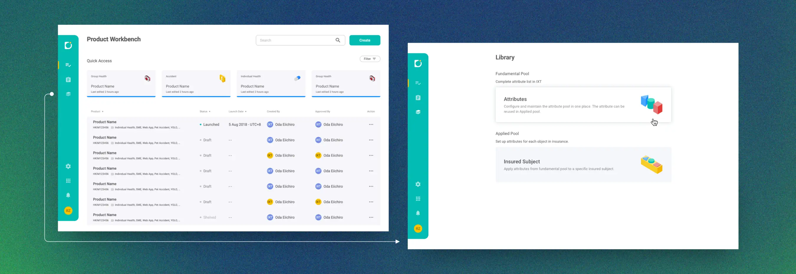
This project initially focused on making systematic improvements to reduce the time required for creating insurance products by centralizing the properties of plans, insured subjects, and attributes. This change meant operators wouldn't need to repeatedly set up properties if they were already established. We quickly developed a wireframe and tested it with internal users. Their feedback revealed the need for clearer and more intuitive guidance to help users locate the library where they could access the necessary properties.
Secondly, and more importantly, even some interviewees could complete a task which was to find certain properties from the library and add them to the place required, it's still quite demanding for them to understand the concept about the hierarchy of insurance product and its settings. Since it's a foundational and important knowledge for everyone to use this system, it brought us to our design statement...
How might we reimagine the insurance product creation process to make it more seamless, intuitive, and all-encompassing for users
- Universal Principles of Design
During my research, I was deeply influenced by the concept of mental models—representations of systems and environments shaped by experience. People rely on these models to understand and interact with systems by comparing their expectations with real-world outcomes.
For many users, developing an insurance product can feel abstract, as it’s not a common task they encounter in daily life or through other systems. With this in mind, our goal was to bridge this gap by designing the insurance creation experience to simulate real-world scenarios. This allows users to build accurate and comprehensive mental models of how the system works as they interact with it, making the process more intuitive and approachable.
To begin, identify the components—such as screws and wood plugs—just as you would define attributes as the basic units in the IXT system. Next, attach the panels with screws, which parallels inserting the attributes (screws) into the insured subjects (panels). The assembled box, made of panels, screws, and wood plugs, represents a plan comprised of various insured subjects and attributes. Finally, stack the boxes together, illustrating how different plans come together to form a completed product.
The library functions as a data warehouse that stores attributes and insured subjects, enhancing data reusability and simplifying maintenance and upgrades.
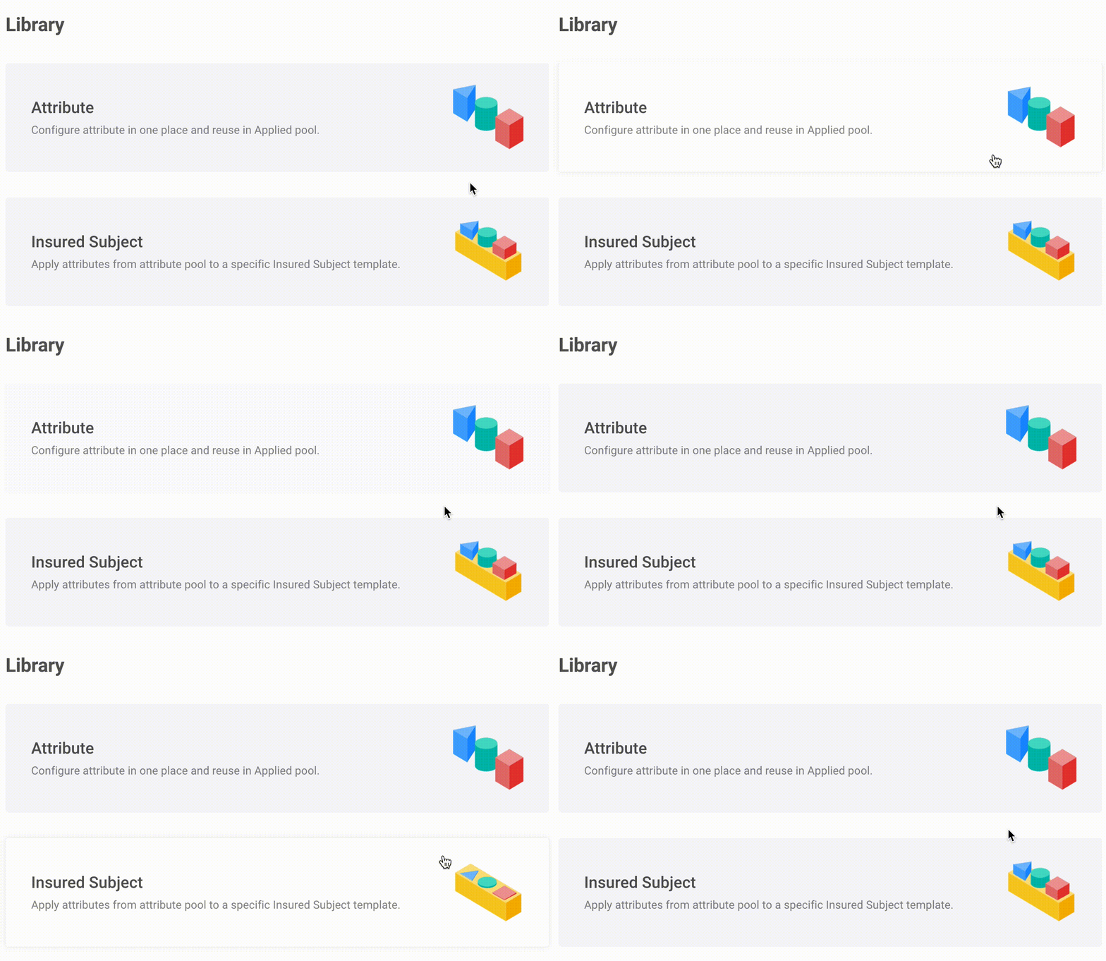
Interactive symbolic icons enhance cross-cultural understanding of signs and controls and, importantly, reflect the information hierarchy of the insurance product.
Creating a product requires users to define numerous attributes, a task that can be repetitive and tedious but is essential. Our goal is to make this process appear, feel, and be as straightforward as possible. By simplifying this experience, we aim to boost user productivity and help newcomers quickly become proficient with the system.
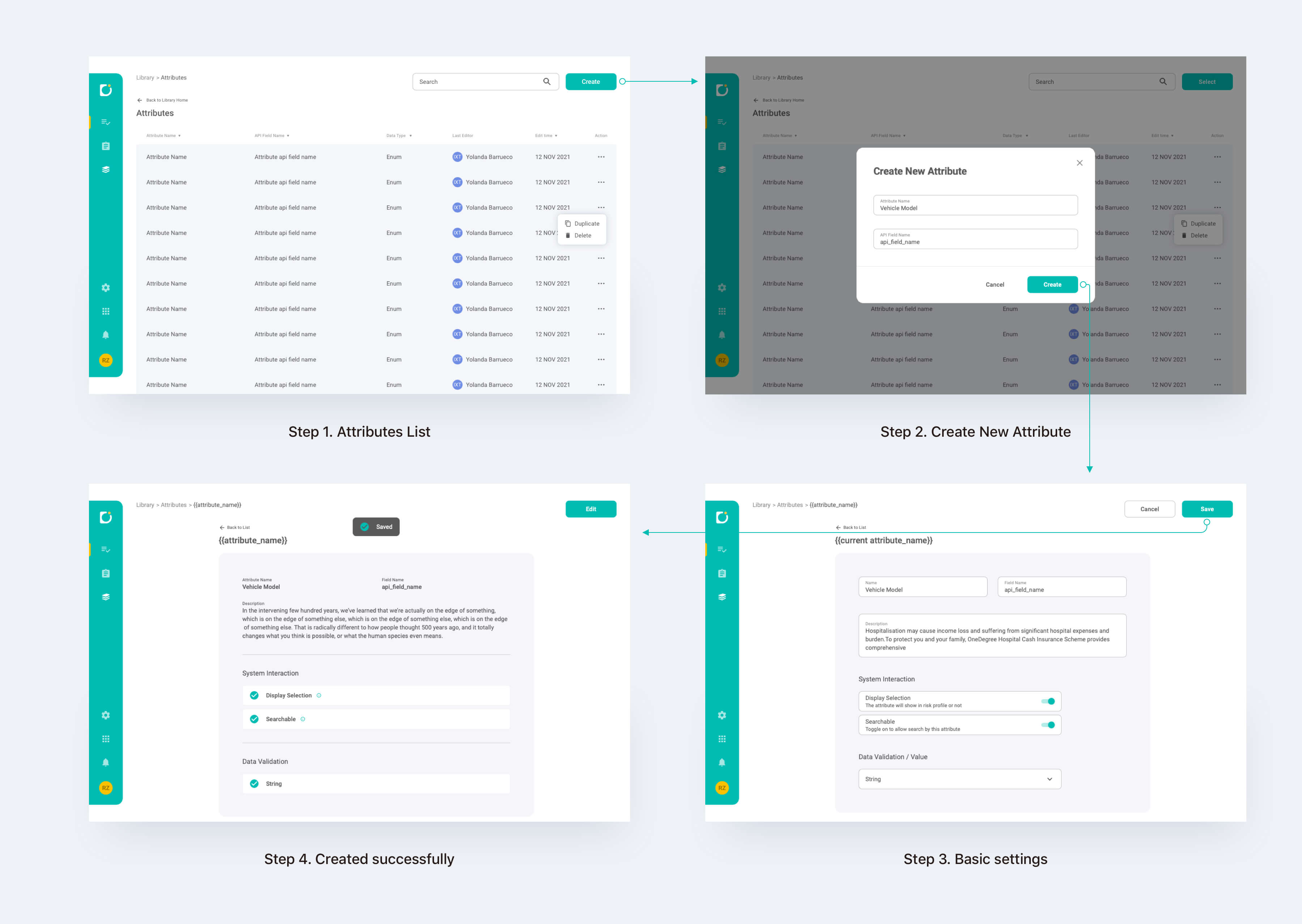
User flow in creating an attribute
Here's how we did to reduce distractions and simplify design for our users:
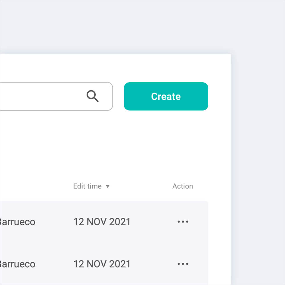
Make the primary button stand out by consistently placing it in the top right corner of the screen across all pages. This familiarity helps users easily locate it. Additionally, by minimizing other colors on the screen, the green primary button will stand out more prominently amidst the information.
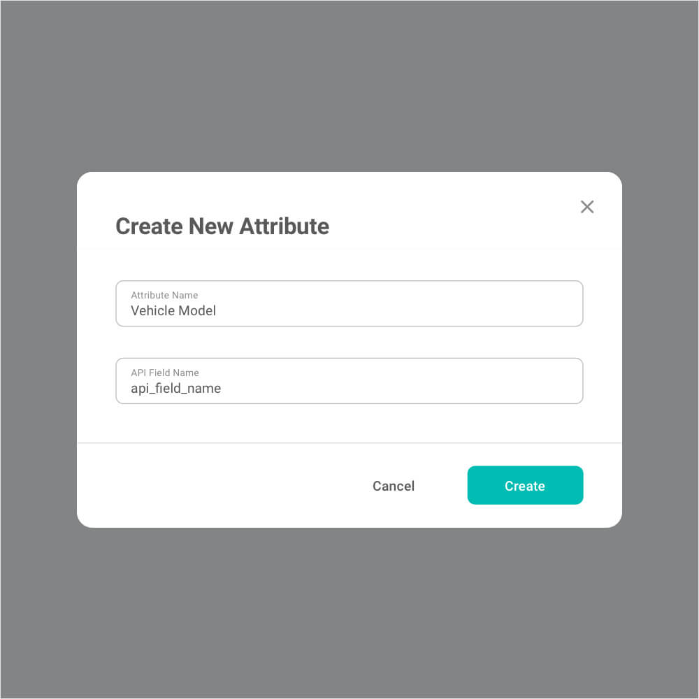
Reduce choices. In the attribute creation popup, users only need to fill out two required input fields. We’ve moved additional decisions to the next page, preventing users from feeling overwhelmed by too many options when they click the Create button.
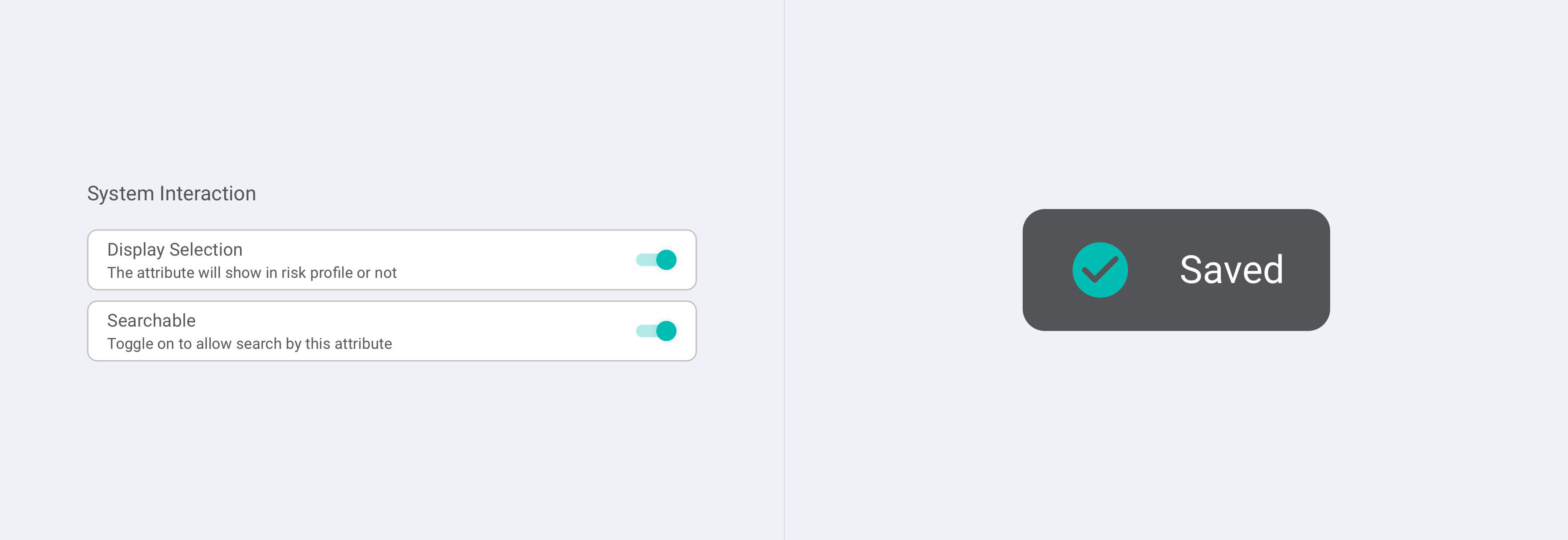
Optimise interactions. The required fields in the basic settings have been designed to be simple and straightforward. For instance, the System Interaction options use on-off toggle switches, allowing users to quickly see whether a function is enabled or disabled. Additionally, a notification toast appears after users make their choices and click the save button, providing a confirmation of success without disrupting the user experience.
If the performance load is low, performance time and mistakes decrease, and probability of accomplishing the task increases. To reduce performance load, the amount of mental activity - memory, perception, problem solving required to accomplish the goal should be minimised. There are deliberated design we made in order to reduce mental activity required and assist users to achieve their goal easily.
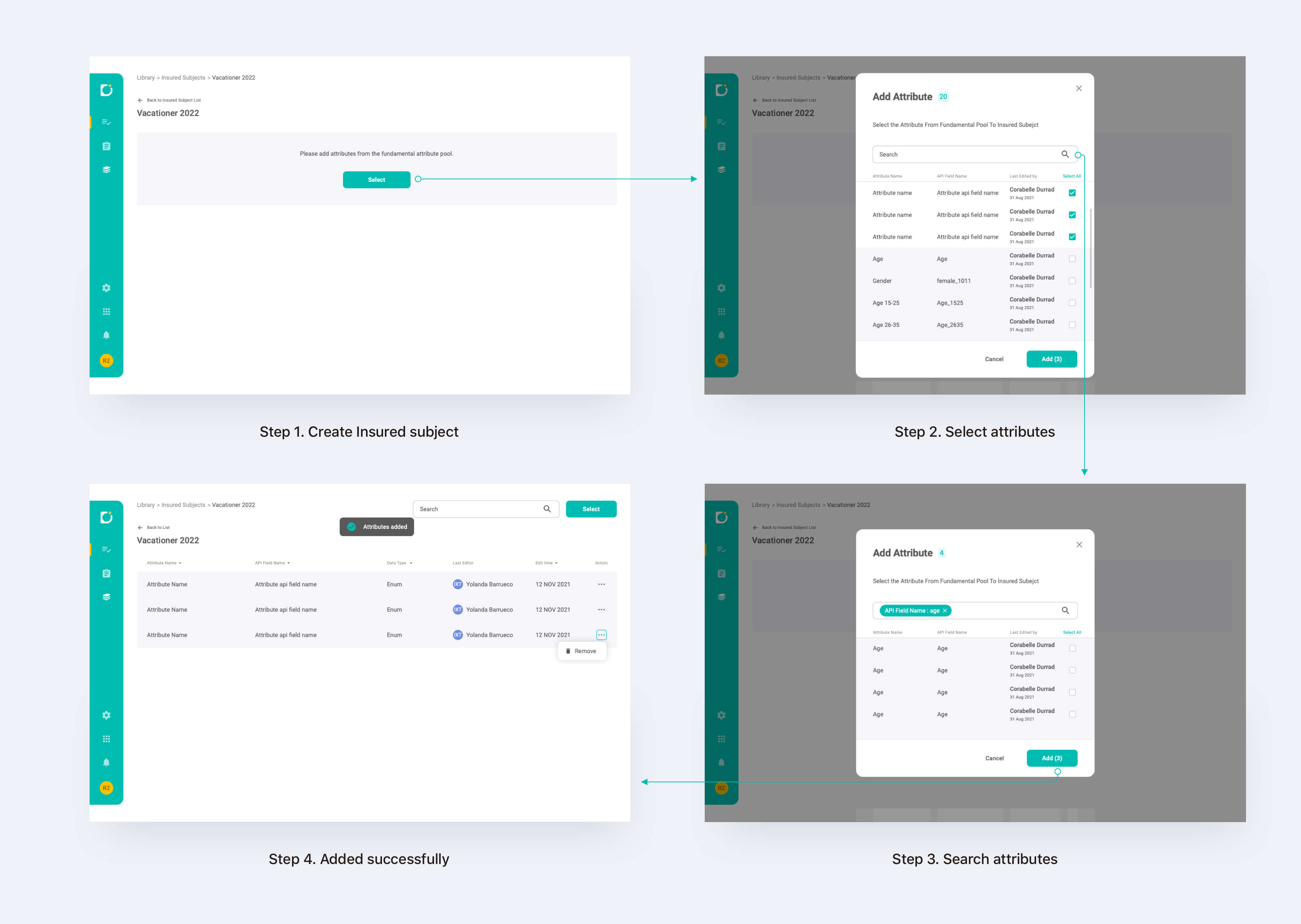
The flow of adding attributes to an insured subject
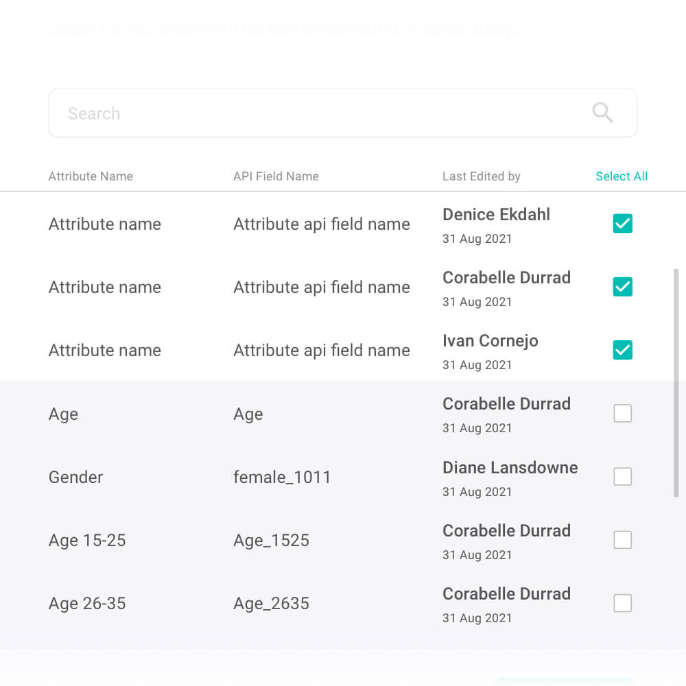
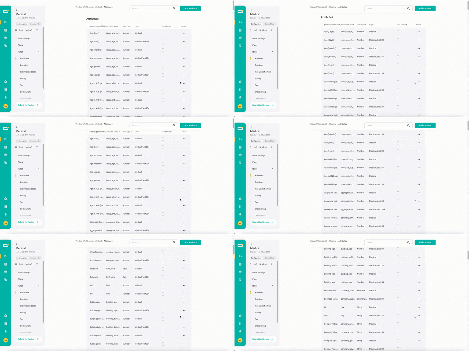
Recognition over recall. To help users quickly fine the attributes they're searching for, the table of attribute provides thorough information including attribute's name, api field name and the person who created it. These completed information help them to recognise which attribute they need much better than giving them poor information and they have to recall it from memeory.
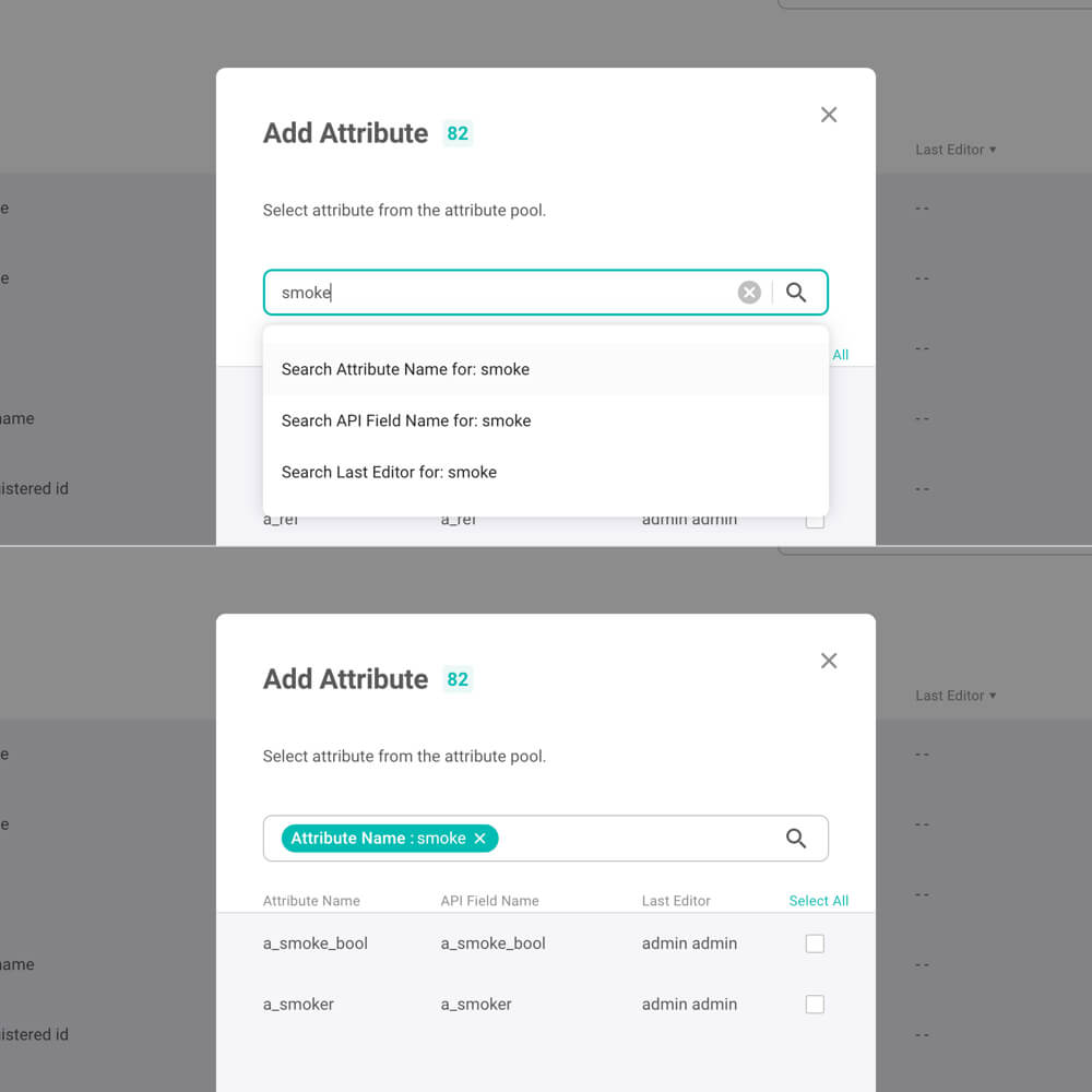
Reduce Cognitive Demand. Users often don't know how to frame their queries. Auto-suggestion can help them narrow down their search and make searching experience more efficiently.
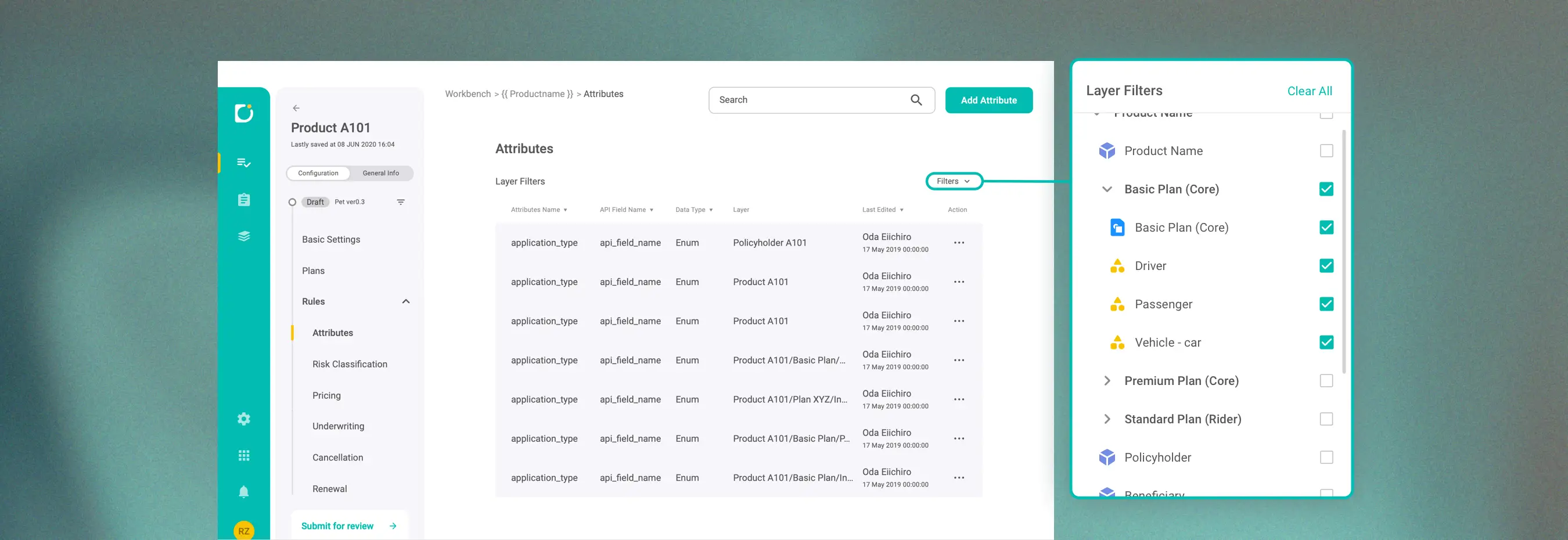
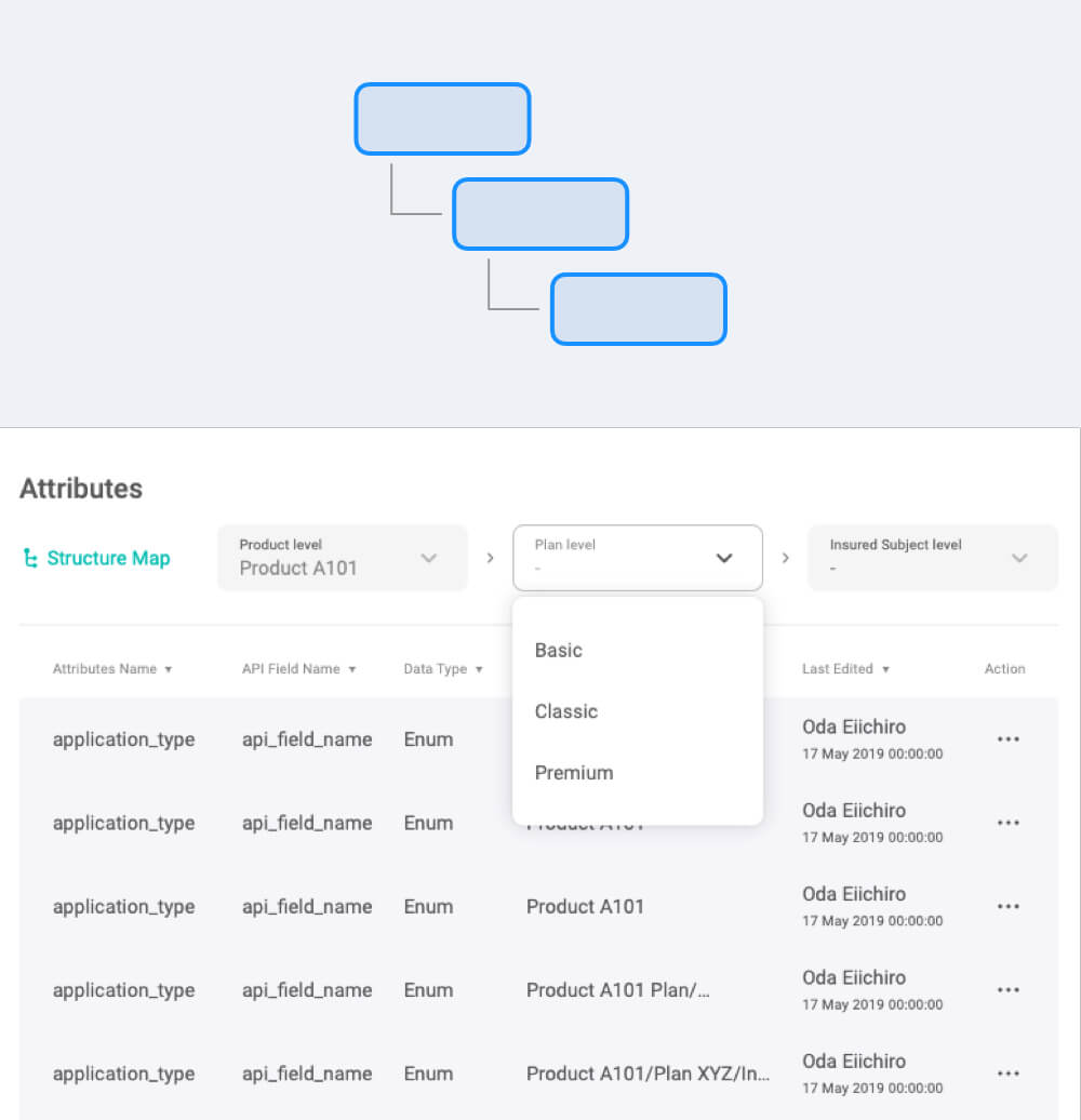
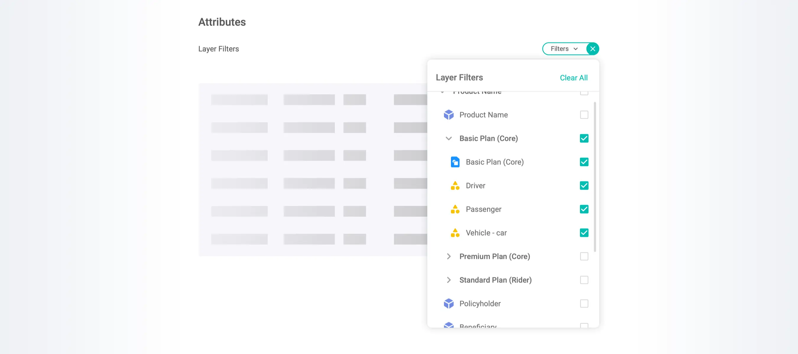
The layer filter is located in the product settings. By enhancing the visibility of hierarchical relationships within the product structure, it helps users efficiently locate attributes and, more importantly, deepens their understanding of the system.
Before the filter was implemented, users frequently faced difficulty finding specific attributes due to the long and cluttered list.
According to the book "The Sciences of the Artificial, there are three basic ways to visually represent hierarchy: trees, nests, and stairs.
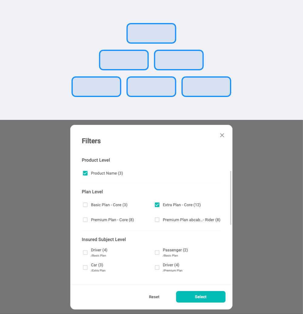
Tree structure - Tree structure is effective for indicating hierarchies of moderate layers, but the hierarchy will be ambiguous when child element (insured sujects) are share by multiple parents (plans).
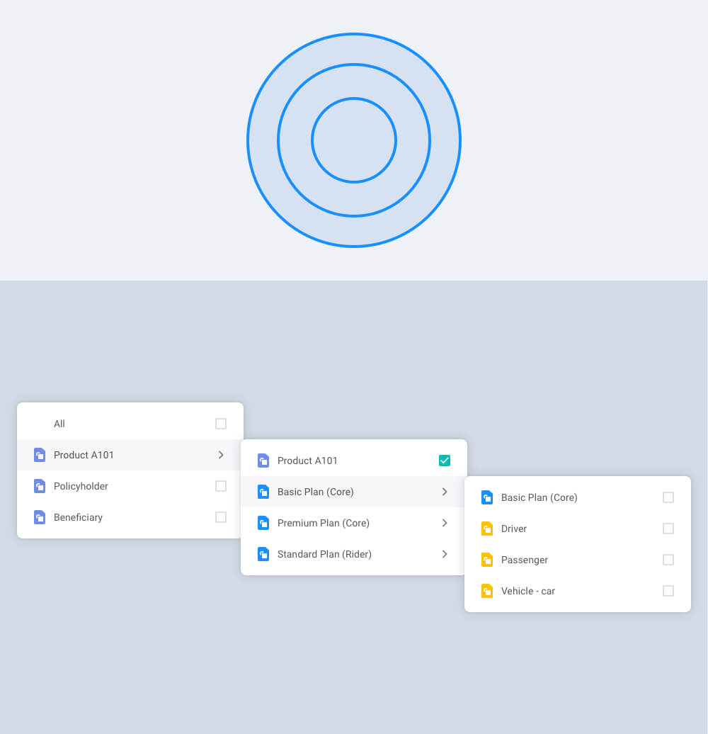
Net structure - Net structure works well in representing simple logical relationships. However, net structure will be hard to illustrate which layer being seleted.
Stair structure - Stair structure is effective for representing complex hierarchies, but is not easy browsed because child elements will be hidden until a parent is selected.
Tree structure
Net structure
Stair structure
By testing prototypes internally, we were able to quickly identify the pros and cons of each modal. I then filtered out the downsides and integrated the benefits that best suited our needs into the new design.
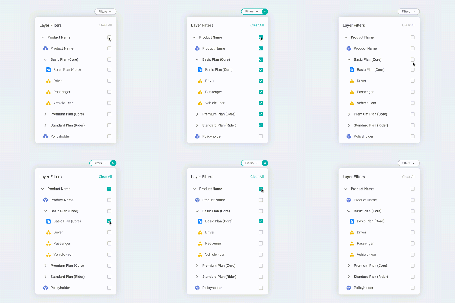
Revealing a minimum information. To avoid users feeling overwhelmed, they will only see items of product level in the first place and click chevron icons to expand plans and insured subjects.
Visualizing hierarchies Each layer has their own icon with a distinctive shape and colour that helps users to quickly recognise.
Handy checkboxes. Checkboxes let users select one or more options from a list. A parent checkbox allows for easy selection or deselection of all items.
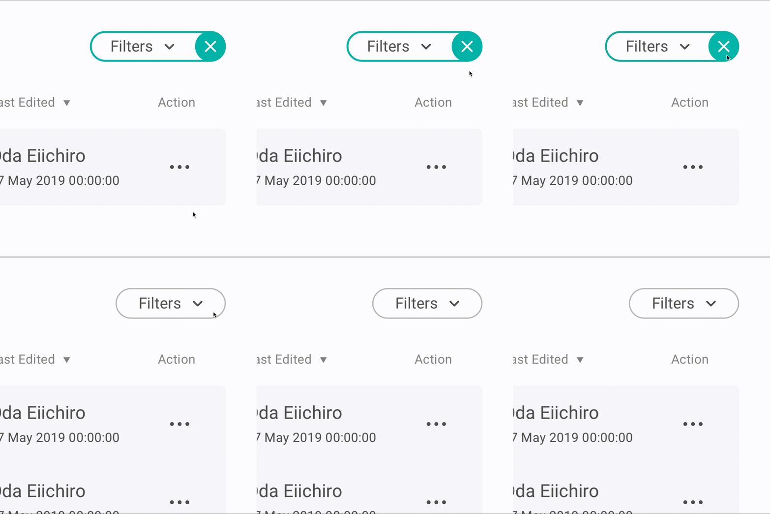
Reset anything by one click. The layer filter with a green border indicates active and users can click close icon to remove all filter conditions.