Snapask Homepage Revamp

Duration: 4 weeks
Duties: From wireframe, user flow to Hi-fi mockup

Homepage is critical that lets users understant what one App value is in the first place. If audiences are confused the service you offer whether has benefits for them, they might shut it down just in few seconds.
After digging into data, we realized that there is still room for improvements for our homepage such as provoking users to tap Ask Question button more and spending more time to browsing our free learning materials.

The Challenge

Apart from the QA feature, we had placed learning content like videos and quiz on homepage. Our purpose was to tell uesrs even you don't have questions to ask, you still can enjoy Snapask by using resouce we have offered. However, it somehow made the homepage impairing its identity - in other words, users especially newbie cannot recognize what is value of this app for them.

Our Goal

1. Increasing amount of questions asked
We want to emphasize the QA main feature, so that new users can quickly reach their aha moment when they're first time using Snapask.

2. Increasing usage rate of sub-features
We want to help users to discover learning resources we've offered and expect they would like to spend more time in the app.
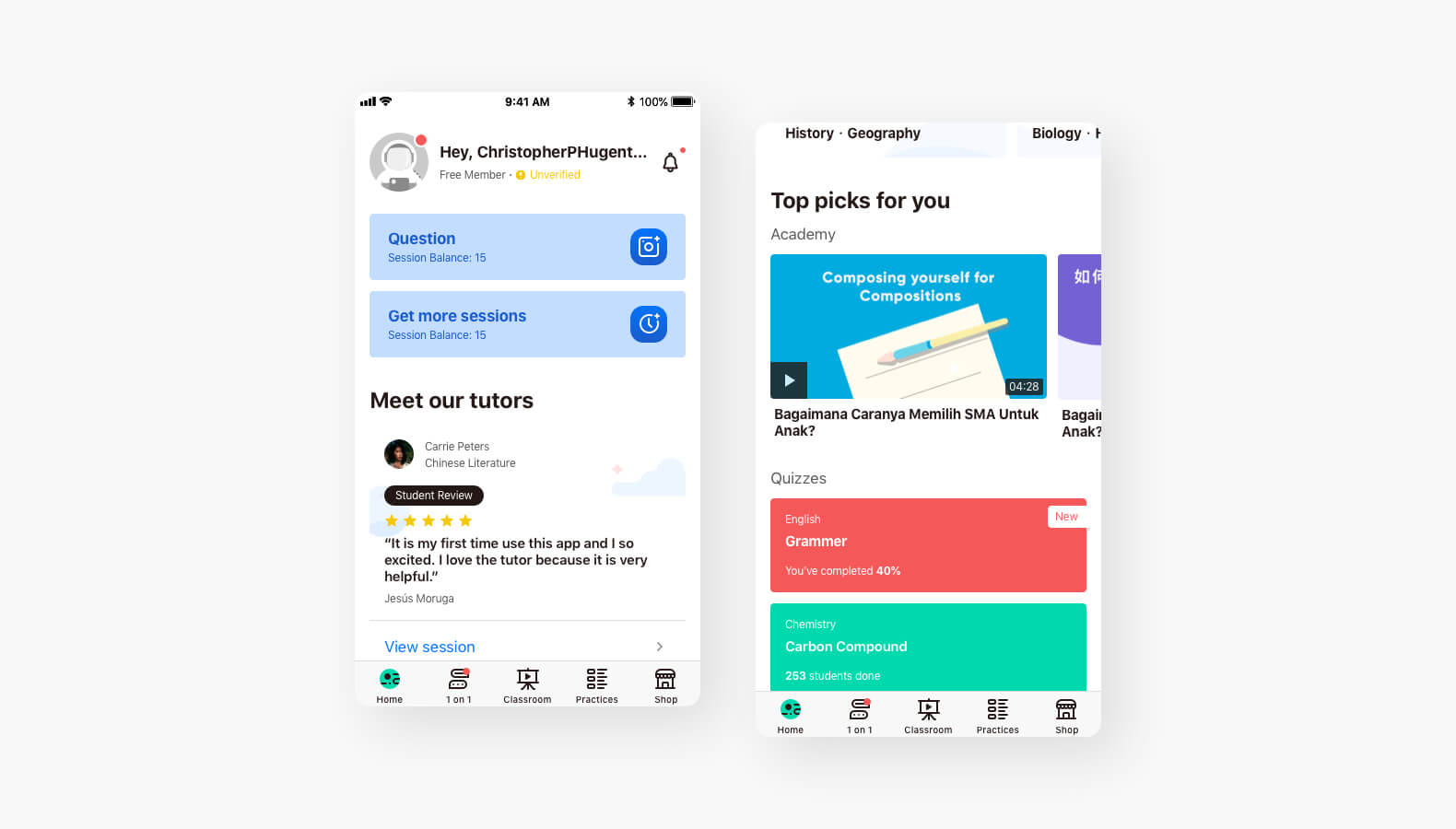
Old Homepage
Building product traits to reach our goal

Product has to speak for themselves - Intuitive, Trust and Personal
After user interviews, we saw our shortages such as not having enough explaination to let users understand how the QA function works, homepage was too messy and users quite often found the content were irrelevant and what even worst was that they (students or parents) have concern for our teaching quality and a service charge.

With that in mind, we nailed down three principles for our new design which are -
1. Intuitive - Users can quickly realize Snapask is an app that helps them to solve questions while studying
2. Trust - Users can understand what they pay for and what they can expect
3. Personalized - Users will feel the personalized experience while using the app.

Intuitive

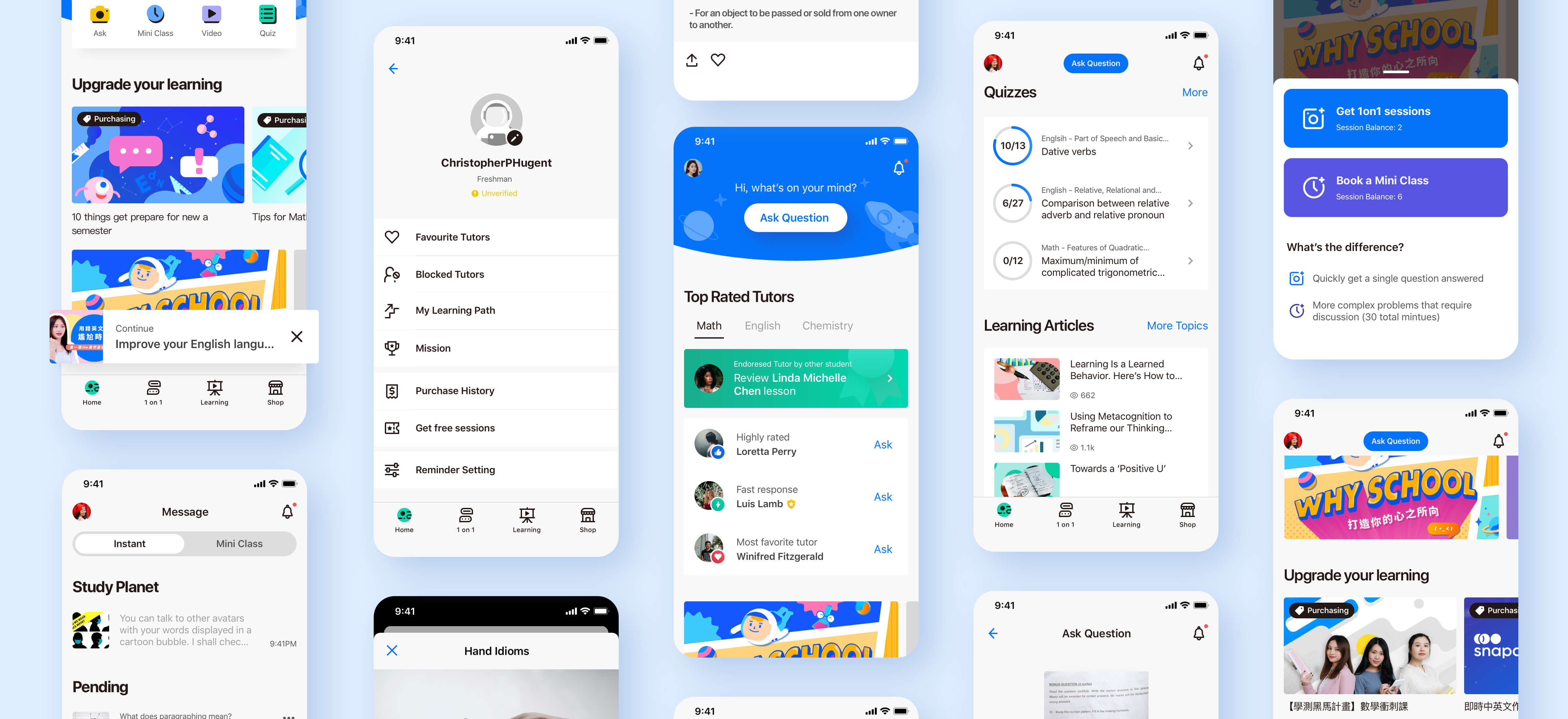
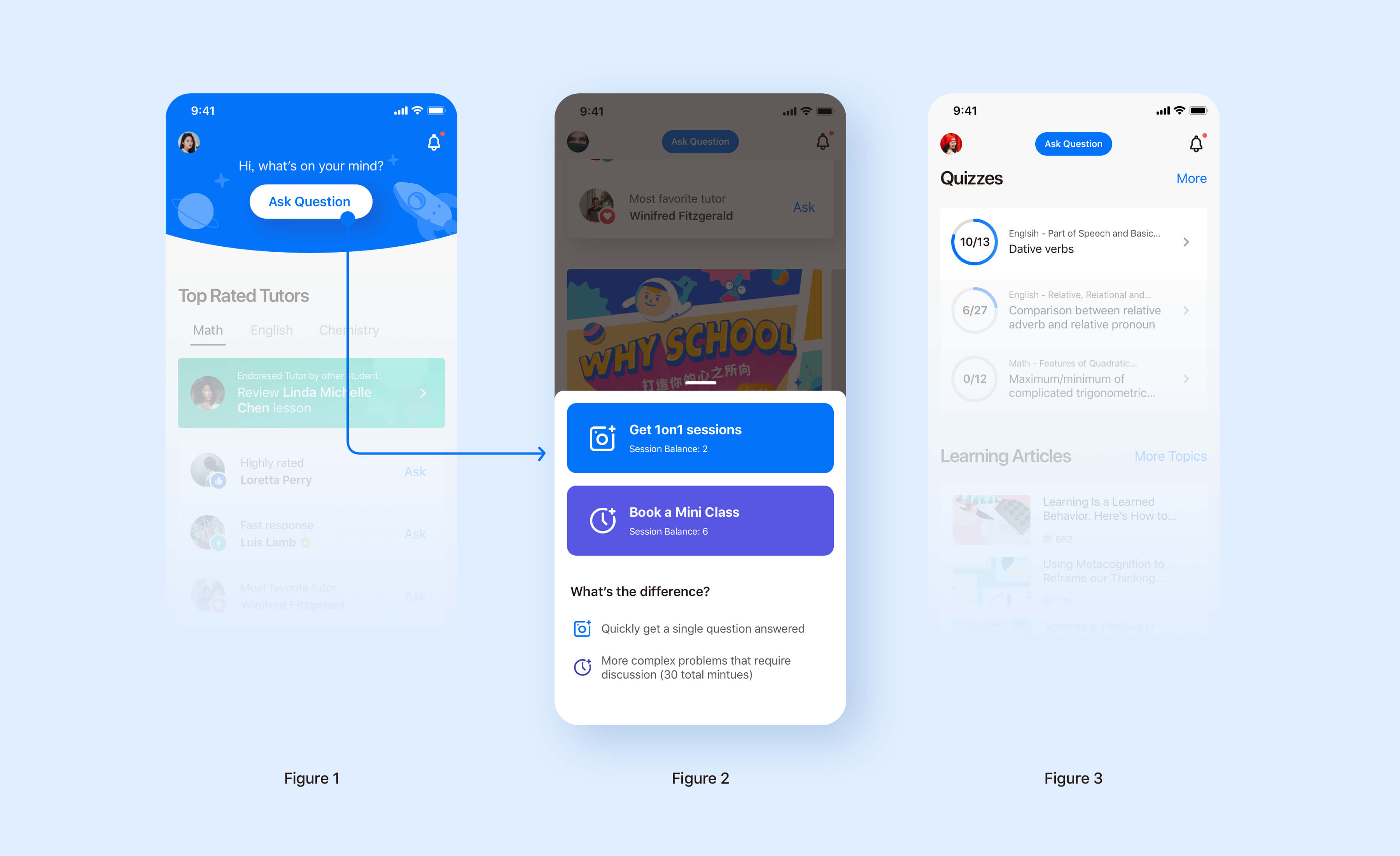
In the old homepage, the new users often got stuck by two main buttons - 1on1 session and Mini class. We found that it takes time for them to figure out what difference between these two buttons. Therefore, in our new design, we combined two buttons into one with the simple Call-to-Action Words - Ask Quesiton. (Figure 1) By simplifying UI and wording, it gives users breathing space to digest the homepage. Once they tap Ask Question, there's an informative explanation below the buttons to help them to choose a question type that suitable for them efficiently. (Figure 2)
Considering the usage rate of Ask Question button is high, we deliberately made it fixes in the navbar while scrolling, so that users would notice it and ask questions handily. (Figure 3)

Trust

From user interview, we knew that most of student parents prefer choosing offline learning resource than digital one to their kids. The reason is not that surprising. They're more assured what they paid for by talking teachers there and seeing their child sit tight in a cram school.
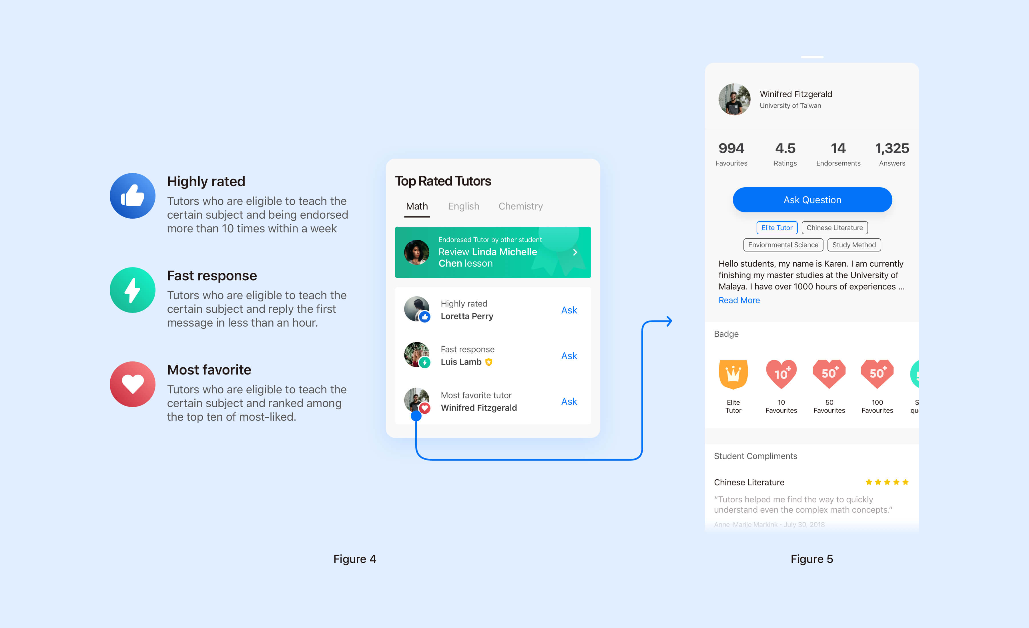
In order to eliminate parents' concern about digital learning, we filtered high rated tutors, according to their quality of teaching, the average response time and amount of endorsements from other stuednts. (Figure 4) Furthermore, users can tap tutor's headshot to get more explicit information. (Figure 5)

Personalized

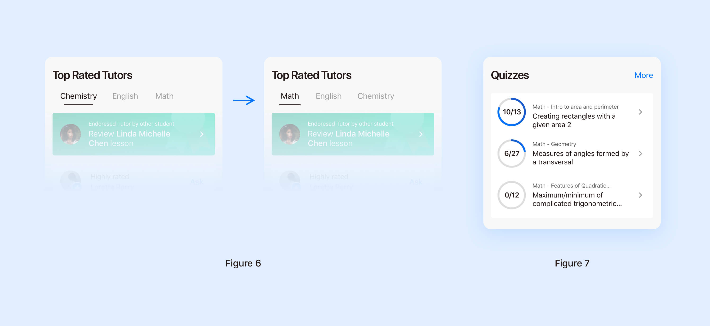
As human, we want to feel special. We want to feel that we are understood and that our needs will be met. That's why we need to give every users a person journey while they using the app. In order to create a great and personalized experience to users, the content they will see in the homepage, to a large extent, based on their behaviour. For example, if a user has frequently asked maths questions, math will be the first subject in Top rated tutors. Thus they can quickly find a suitable tutor to solve their problems. (Figure 6) Meanwhile, users will see math quizzes in Quizzes section. (Figure 7) Furthermore, if users drop out the app while asking an question, doing an quizz or reading an article, they will see a banner pop out to remind them to continue. (Figure 8)

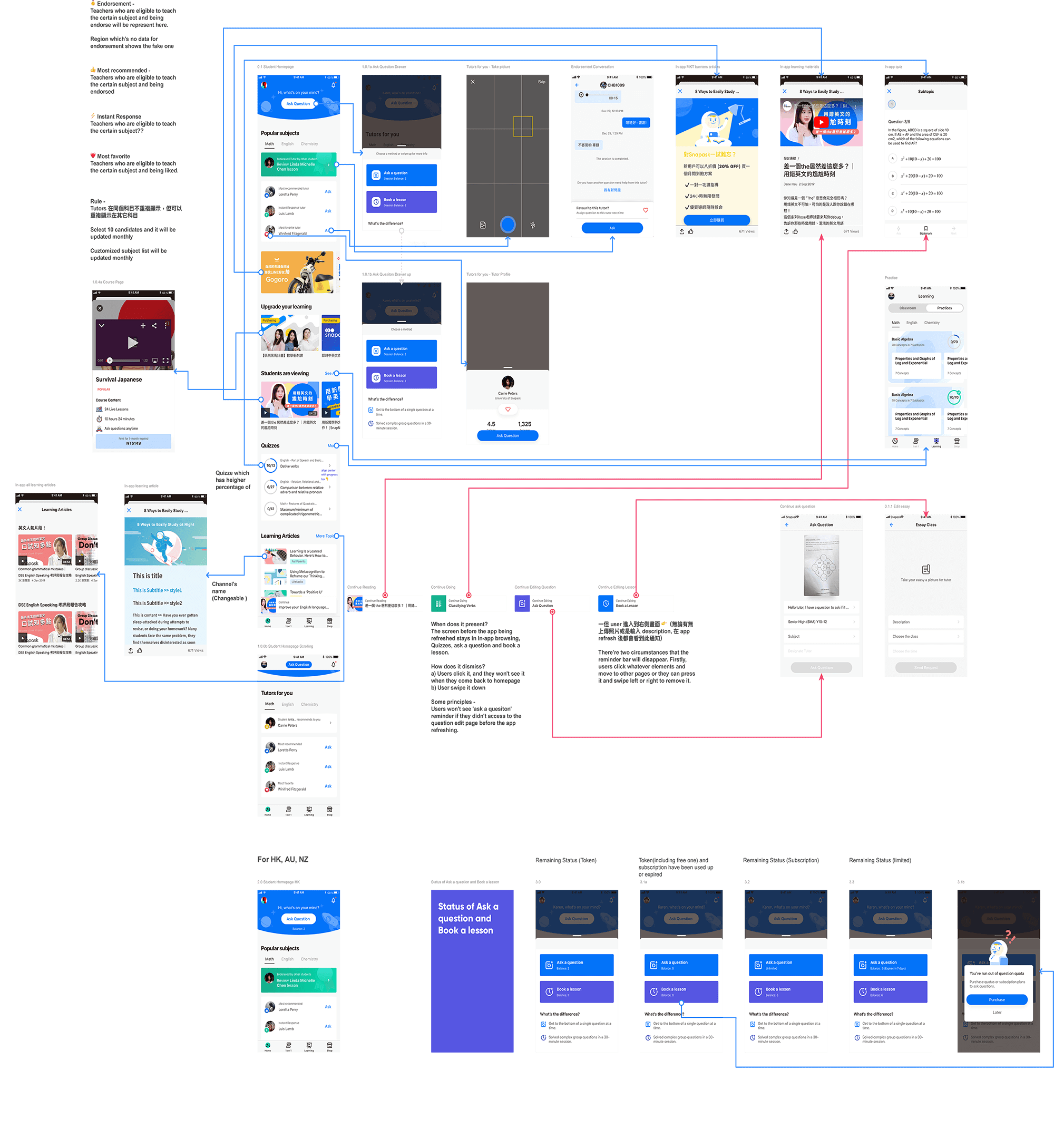
App Flow

Hover to zoom in

Outcome

Compared with the previous version of the homepage, our brand new homepage has increased the usage rate of sub-features by 30%. However, there's no a significant growth of amount of questions asked.

Snapask is a global product servicing across multiple countries. During the design phase, it's challenging I had to interpret my design with stakeholders from different countries and convinced them why every design decisions we made is the best for our users.

Although, results didn't all go as we were expected to, this homepage redesign still validated some of our hypotheses that personalization is the one of key factors to motivate users using one product more. We're looking forward to applying the same methodology to improve other pages of the platform.